Nowadays it can be extremely hard to imagine an accurate presentation without a proper support of digital technologies. PowerPoint is considered to be one of these tools that assist people in delivering information and illustrating the most important points in a visual way. With the help of it, you can provide listeners with additional information and, in addition to this, give listeners a chance to get a structured and well-balanced information. Bored with the same PowerPoint presentation?
Don’t fret. With a big choice of best business PowerPoint templates, even the sky is no limit. Anyway, keep in mind that a PowerPoint presentation should be tailor-made and thought-out.
In this article, you will get familiar with 15 tips on how to make an impactful presentation and catch the eye of your audience with it. So, let’s take a glance at these essential points.
Recommended: How to Build A Personal Brand with WordPress Blog

Create a Powerful Presentation
Tip #1: Try to Create a Coherent and Stylish Presentation
The main task of every PowerPoint presentation is to deliver a crucial message or a few messages that are connected with each other. To cut a long story short, those presentations that have a logical and coherent structure affect listeners in much better way. In addition to this, they allow an audience to pay more attention to the content of the presentation, not its design.
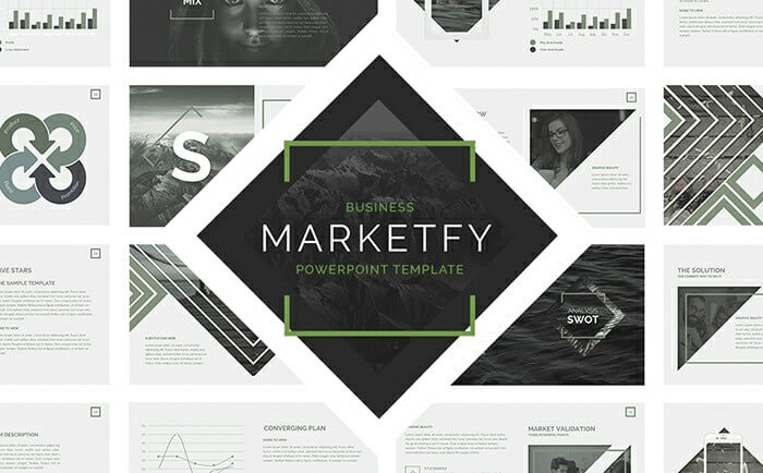
Yet when you start making your future presentation, it would be nice to think over its design in advance. It means that, first of all, you need to choose a design and only then fill your slides with information. In general, you can play around with default PowerPoint templates or search for the custom ones that the Internet is overloaded with. If you decide to work with custom templates, you will give a wonderful opportunity to get the most good-looking presentation without racking your brains about fonts, styling, and layouts. As an example, you can visit to check out a great collection of PowerPoint templates.
Tip#2: It’s Better to Show Information Rather Than Tell
Generally, it would be better to display only the main points on your slides. When one presents a lot of information with the help of presentation, listeners will focus on slides instead of your speech. Keep in mind that a presentation is considered to be something additional that doesn’t need to cast a speaker into the shade.
To start with, make certain that your presentation consists of the most important points without their detailed explanations. In such a way, you won’t need to read out loud these messages already presented on the screen. In addition to this, slides are considered to be great means of presenting information in a well-structured and logical way. In such a way, you’re able to make a step-by-step presentation that will be absolutely acceptive for your listeners. Finally, if some points seem to you a little bit ordinary, don’t include them on the slides. There is no need to make slides that provide the audience with a zero-value.
Tip #3: Make Use of Infographics
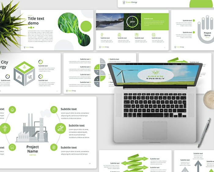
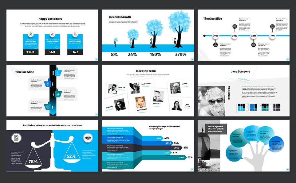
Without a doubt, you’ve already heard about such a visual tool as Infographics. This option always helps to present content in a clear and understandable way. To say the truth, infographics are this very thing that every presentation should include. Powerpoint gives you a chance to create various mind-maps, diagrams and so on and so forth. Don’t be afraid to use this chance. Use some time to build a few mind-maps that really help to add some visualization. In such a way, you will stick to the point and show the interconnection between the most important aspects. By the way, infographics work decidedly better than ordinary bulleted lists.
Tip #4. The Column Structure is Essential
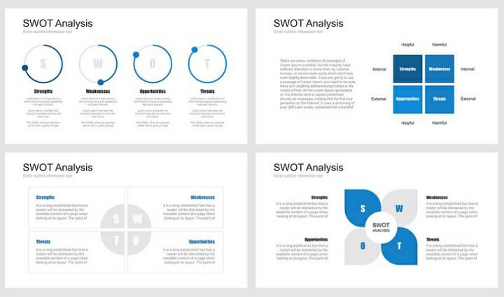
Like it or not, but your PowerPoint presentation can sometimes look a little basic when printed out. Why? The answer is obvious. Your sliders do not conform to how you’ve used to read content. Remember, every time you read a newspaper or magazine you use the way of reading content in columns and structure. PowerPoint follows the same idea. It’s default setting. So, remember, it’s important to structure your sliders properly. The column structure is vital for creating a cohesive PowerPoint presentation.
Tip #5: Throw An Ordinary Bulleted List Out of Your Head
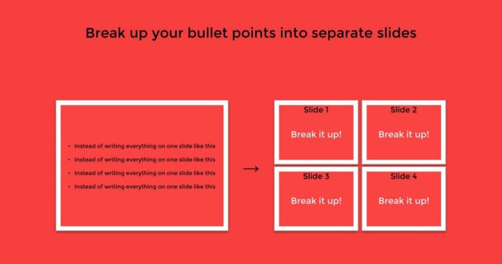
As you can understand, a default bulleted list is not considered to be an ultimate solution. In most cases, it looks extremely typical and simple. If you have a desire, it would be better to use a mind-map instead of the bulleted list. In such a way, you will get an information that looks sounds appealing. Yet if you want to give a detailed information about every point presented in the bulleted list, you will need to divide it into several slides. Less content on the slides – more impact on the audience.
Anyway, if you think that a bulleted list cannot be replaced by any other type of infographics, pay your attention to styles included in your PowerPoint templates. For example, a template presented below comes together with more than 20 unique styles of bulleted lists that have an absolutely spectacular look.
Tip #6: Make Sure that Listeners from Every Corner of the Room Can Read It
Actually, when you create a presentation, you shouldn’t miss the memo about the presentation readability. If you choose a font size that would be not very comfortable to read from different corners of the room, it can turn into something that will completely destroy your presentation. For this very reason, we would highly recommend using a font that is not smaller than 28 pt.
In addition to this, you should pay attention to such aspects as a meaningful choice of the font and an excellent contrast. Don’t forget that a mix of a black font with a white background provides listeners with the best readability as, in such a way, you reach a great contrast. In order to find out more about fonts, check out the next tip.
Tip #7: Use Attractive Fonts
It’s not a big secret that font is something that means the world to a PowerPoint presentation. An elaborate font choice not only makes the content more readable, it also takes fancy of the audience and makes them follow the slides together with your speech.
All things considered, professionals offer you to not use the standard Microsoft Office fonts like Calibri, Times New Roman or Cambria and try to find something that looks more spectacular and eye-catching. Actually, on the other hand, don’t overuse with a needless luxury and sophistication as you don’t need to side-track listeners attention from your message.
In general, the best way to decide which font would be right for your PowerPoint presentation is to look through the fonts that are popular and widely-used these days. For the most part, they will be minimalist, distinctive, exciting and, what is more important, readable. As an example, sans-serif Helvetica is considered to be that very variant that works perfectly in point of PowerPoint presentation.
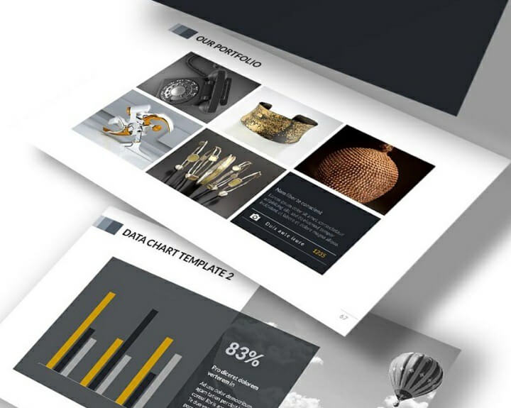
Inspirational PowerPoint template is a creative choice that comes together with tailor-made slides that look absolutely lovable and amusing, including these fonts that will make your presentation readable and attractive.
Tip #8: Use Eye-Catching Visuals

As we’ve mentioned on the top, one of the keystones of your presentation is the use of remarkable infographics. Bright visuals are considered to be the second keystone. We don’t say that it would be nice to turn your presentation into a photo-album, but a few vibrant and engaging images are exactly what you need. High-quality pictures can help you to get a great interaction with your listeners and, in addition to this, provide them with a journey-like experience. What is more, images have a tendency to strike people’s eye. For this very reason, it will be reasonable to use images after or before slides with an important data.
Tip #9: Give Priority to Vibrant Colors
If you want listeners to take notice of your presentation, you should try to use bright colors. Don’t be afraid to highlight the basic aspects of your speech with accent colors even if you deliver a presentation about some serious topics.
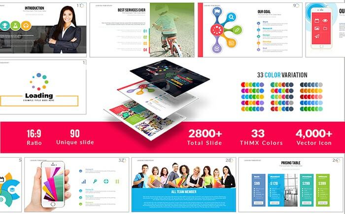
Green, red, light blue, magenta, and orange are these vibrant colors that should be implemented in your presentation. Mix various hues in order to find out which one suits perfectly to your presentation.
If you’re not sure that colors have a great power in a presentation design, take a glance at the Loading Powerpoint template presented below.
Tip #10: Make Certain that Your Design is Related to the Main Purpose of the Presentation
To say the truth, it’s a little bit difficult to give global tips on a presentation design. Something that will look out-of-the-ordinary in one presentation, will look out-of-position in another one. For this very reason, you should always stick to the point. Keep in mind the main idea of your presentation and check out the relevance of your design to its key message. A color scheme, visuals, fonts – all of them should blend and deliver a concept of the presentation in the best possible light.
By the way, if you build a business presentation, try to implement a minimalist design that comes alongside with a white background and red/green/blue highlights. Don’t use tons of various images and expend time in making infographics.
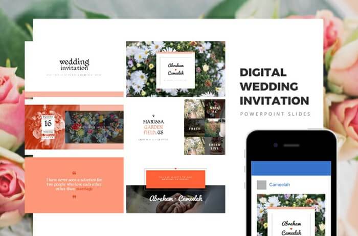
If you want to create a creative presentation, you can take a look at the template that includes an exquisite imagery, a wonderful palette of low-key colors and artful handwritten fonts.
Tip #11: Bring to Your Notice Various Web Design Trends
In order to create a nice-looking PowerPoint presentation that will win the heart of your audience, you should think about the latest web design trends. In general, what works online, will work on your slides, too. That’s why you should try to build a minimalist presentation that includes a great mixture of negative space and content. In addition to this, don’t forget that you need to use high-quality media. If you make use of modern web-design trends, your presentation will definitely turn into something that will make your listeners agape with wonder.
Tip #12. Branding is Key
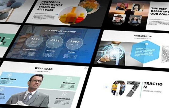
Well, sometimes when assembling slides for the PowerPoint presentation, you can choose the wrong way – clip art. Indeed, there is a big number of tricky animations and slide transitions which can simply pollute your brand’s message. The point is that they are easy to use and moreover, can be used by anyone else before. So, if you’re trying to deliver some unique message with your PowerPoint presentation, avoid clip art. The truth is that it doesn’t relay your information. Simply put, it’s easy to fall into the trap and make a circus of effects. So, think about your brand message first. Focus on a big picture.
Tip #13. Humor the Audience
It’s undeniable fact that computers are great these days. But, the speaker’s presentation is just as important as the presentation on the screen. The problem is that most speakers turn on the dull presentation mode while the audience gets up and walks out or simply is lulled to sleep. For some reasons they are sure they have to strip the talk of any fun. Don’t underestimate entertaining presentations. Think of it this way, if you’re not enthusiastic about the product or service you represent, how do you expect your audience to be? Tricky question, right?
The idea of any presentation is to sell something, no matter if this is just an idea, product or service. Thus, with the boring topic, you simply can’t convey the idea of your message. So, find a funny image and put it on a slide. The task of any speaker is to get the audience to pay attention to the topic of the presentation. Nothing gets peoples’ eyes up from their phones like thinking they’re missing something good.
Tip #14. Add Quality Content
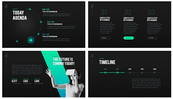
Indeed, content is key. Taking into consideration that most people have no idea of what you’re talking about, keep your content clean, simple and logical. This means that the audience should easily get the true message that you try to convert through your presentation. Instead long and heavy content can make them feel bored. Besides, it’s smart tip to include catchy quotes which can resonate with the audience. Minimize your content to just a few simple words. Make the audience listen, not reading.
Tip #15. Make Sure You Limit Punctuation
Like it or not, but the PowerPoint presentation is not the place to proclaim any ideas. If you want to emphasize or highlight any points of your presentation – do it while speaking. Avoid punctuation. The main focus of your presentation is to convey the message. Make it easier for the audience to digest it.
Conclusion
PowerPoint is considered to be an amazing tool that allows you to create remarkable masterpieces with the help of a good-looking layout, eye-catching color palette, and bright imagery. These things combined into one single unity will give you a chance to generate buzz with your speech. In order to create a powerful PowerPoint presentation, you should work properly with its fonts, infographics, styling and, in addition to this, including some of the contemporary web-design trends. If you pay your attention to these 10 tips on creating a stunning PowerPoint presentation, you’ll certainly produce an impression on the audience. Thanks for reading!

